Stunning and haunting photographs by Finnish photographer, Pentti Sammallahti. See more on the Nailya Alexander Gallery website.
Monday, November 19, 2012
Thursday, November 15, 2012
Nina's wedding stationary
One of my oldest friends, Nina, is getting married this summer and as her wedding gift I am designing her wedding stationary!
Nina and I grew up together at the beach and I was not at all surprised when she told me that the ceremony would be on the beach near Long Island Sound. She asked that the stationary be casual, whimsical and somehow incorporate succulent plants, as she would be decorating the reception with succulents.
Based on some inspiration from her Pinterest account, I started drawing letters and created a little water color painting of a succulent plant.
The illustration didn't quite capture the succulence of the plants, and when I showed Nina the gorgeous font, Leitura Swashes, by Dino dos Santos, any attempt to draw more appropriate letters seemed absurd. I simplified the design and created a complementary lace-like pattern (did I mention that the reception will be held in a lace factory?) and voilà!
Here is a sneak peek of the save the dates:
Wednesday, April 25, 2012
Sunday, April 22, 2012
new work, new moves
Having completed all the work for my impending MA (except my dissertation, of course) I'm excited to have added two new projects to www.clairesmalley.com.
The book, Home, is the result of an investigation into people's perceptions and definitions of "home". The purpose of the book is neither to define nor draw conclusions about the concept, but rather to highlight its importance. This was a group project and we all not only thoroughly enjoyed the process, but also learned a great deal about the subject.
The cover for Alice's Adventures in Wonderland is a redesign of a Penguin Classic.
In addition to finishing the course, I'm also looking forward to my impending relocation to Washington, D.C. After (what will be) nine incredible months abroad, I'm excited to go home and start the next chapter of my life!
Tuesday, February 21, 2012
Tim Walker: photographer
Thanks to the lovely Katie Evans for enlightening me about Google's search-by-image feature, I now know not only the architects of the houses in my previous post (Durbach Block Jaggers and Olson Kundig) but also the mystery photographer of this photo that I posted in 2010. It originally appeared in the 2009 spring catalog of Hermès.
Tim Walker
Thank you, Google and Katie.
Tim Walker
Thank you, Google and Katie.
lost credits
I have a big issue with sites such as Tumblr, Ffffound and Pinterest. As much as I love inspiration boards and sharing images, I find it incredibly frustrating when I cannot find any information at all about a particular image. While perusing photos of houses on ffffound.com today I am unable to find the architect, location or even photographer of a single photograph. I imagine most people would agree that this is a problem but I don't know what the solution is: include photo credits in the file name? Still, other information is lost; cite the source of a photo when you share it? I know a lot of people who do this consistently, but not everyone. Once an image is shared without a link to its source, finding its origins becomes exponentially more difficult.
People deserve to be credited for their work and patrons deserve to know whose work they're admiring.
On that note, these houses are beautiful and if someone could tell me something about them I would be grateful.
People deserve to be credited for their work and patrons deserve to know whose work they're admiring.
On that note, these houses are beautiful and if someone could tell me something about them I would be grateful.
Labels:
inspiration
Thursday, January 26, 2012
Sophie Blackall creates playful illustrations inspired by craigslist "Missed Connections"
Some of my favorites include:

Sunday, February 28, 2010
- m4w - 36 (Brooklyn)
You had pink fingernails and got on the Q train at Atlantic (if not Dekalb). I felt an irrational desire to invite you out to dinner. I found you stunningly beautiful, but you'll probably never know. I think you changed trains at Times Square and I watched as you stepped between closing doors and disappeared. If for some reason you check this, It'd be nice to hear from you. Either way, I hope you're well.

Check out Sophie's blog at
http://missedconnectionsny.blogspot.com/

Sunday, February 28, 2010
- m4w - 36 (Brooklyn)
You had pink fingernails and got on the Q train at Atlantic (if not Dekalb). I felt an irrational desire to invite you out to dinner. I found you stunningly beautiful, but you'll probably never know. I think you changed trains at Times Square and I watched as you stepped between closing doors and disappeared. If for some reason you check this, It'd be nice to hear from you. Either way, I hope you're well.
Thursday, June 3, 2010
-w4m
I was the face painter at party today
and you were there.
jake?
jason?
john?
something or another.
you had a nice face.
i would of liked to have stayed and chatted but me and my co worker had other parties to attend to.
Check out Sophie's blog at
http://missedconnectionsny.blogspot.com/
Labels:
inspiration
Tuesday, November 8, 2011
Stag 16 auction for the homeless
On November 15th, Graham and Green, the British luxury interiors and homeware shop, will launch an auction of their resin stag heads reworked by some of the most popular contemporary artists and designers in the UK. Proceeds go to Centrepoint to support young homeless people in London.
I love this idea! Graham and Green's eccentric wall pieces are an exciting and unconventional canvas for any artist, as evident by how differently they turned out. I would love to see Stephen Webster's dark dollhouse stag up close.

Among the artists are Ronnie Wood, Monolo Blahnik and Rob Ryan:


Check out the auction here:
grahamandgreen.co.uk/stag16
www.grahamandgreen.co.uk/
www.centrepoint.org.uk/
I love this idea! Graham and Green's eccentric wall pieces are an exciting and unconventional canvas for any artist, as evident by how differently they turned out. I would love to see Stephen Webster's dark dollhouse stag up close.
Among the artists are Ronnie Wood, Monolo Blahnik and Rob Ryan:
Check out the auction here:
grahamandgreen.co.uk/stag16
www.grahamandgreen.co.uk/
www.centrepoint.org.uk/
Labels:
inspiration
Sunday, October 23, 2011
Rob Ryan: judging books by their covers
On Friday I received an early birthday card from my mom. Surprise! A Rob Ryan card that I had admired in the Saatchi Gallery gift shop when I first moved to London and my parents were visiting. Apparently, my sweet and sneaky mother bought the card that day!
The first time I saw Rob Ryan's work was in an airport book store. I bought John Connolly's The Book of Lost Things because of it's gorgeous, whimsical cover and read the modern fairy tale during my travels.

A few years later, I read Dara Horn's The World to Come because it was recommended to me on Amazon and had a familiar, cut-paper cover. Finally, I discovered This is For You, a stunning, romantic book comprised of Rob Ryan's prose about love intricately cut from paper. The introduction reads, "If you believe in love, but find it difficult to explain--this is for you." When I found it years ago, I bought this book for my mother and now that she's sent me my own Rob Ryan piece, we've come full circle.
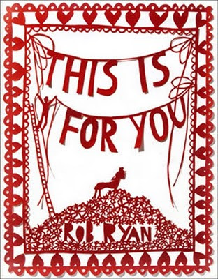
Enjoy Rob Ryan's portfolio and visit his Etsy shop!
www.misterrob.co.uk
www.etsy.com/shop/misterrob
The first time I saw Rob Ryan's work was in an airport book store. I bought John Connolly's The Book of Lost Things because of it's gorgeous, whimsical cover and read the modern fairy tale during my travels.

A few years later, I read Dara Horn's The World to Come because it was recommended to me on Amazon and had a familiar, cut-paper cover. Finally, I discovered This is For You, a stunning, romantic book comprised of Rob Ryan's prose about love intricately cut from paper. The introduction reads, "If you believe in love, but find it difficult to explain--this is for you." When I found it years ago, I bought this book for my mother and now that she's sent me my own Rob Ryan piece, we've come full circle.

Enjoy Rob Ryan's portfolio and visit his Etsy shop!
www.misterrob.co.uk
www.etsy.com/shop/misterrob
Labels:
inspiration
Tuesday, October 18, 2011
elegant lighting from Shine Labs
Saw these on Fab.com. Similar to Tord Boontje lighting in the variety of textures and whimsical forms.
Based in San Francisco, Shine Labs offers contemporary lighting and home accessories.
Based in San Francisco, Shine Labs offers contemporary lighting and home accessories.
Labels:
inspiration
Thursday, June 9, 2011
Friday, May 27, 2011
Tuesday, April 12, 2011
Friday, January 28, 2011
let this be our little secret / no one needs to know we're feeling / higher and higher and higher
Recently listening to Passion Pit's album "Manners" quite a bit; I dig music that inspires uncontrollable dancing upon listening. These songs make sitting still nearly impossible.
Passion Pit re-released a deluxe edition of the album last year with artwork by Robert Seidel, whose digital work looks simultaneously mechanical and organic. If liquid paint could be applied with a keyboard, this is how it would look.

Labels:
inspiration
Thursday, January 27, 2011
strangescape
I think I fall in love with strangers. In my mind, I turn them into landscapes, and you are that spot just outside the city where the river tip-toes along and the train tracks run parallel and they would hold hands if they could but parallel means never touching.
This morning three inches of ice covered my car. I tried to tap on it with the broken side mirror and some of the ice cracked and fell to the street but then I shattered the whole window. I don't know what else I should have done.
This morning three inches of ice covered my car. I tried to tap on it with the broken side mirror and some of the ice cracked and fell to the street but then I shattered the whole window. I don't know what else I should have done.
Labels:
writing
Tuesday, January 25, 2011
paper scraps
About a year ago, I created menus at work and, after trimming them, was left with hundreds of one inch wide strips of off-white cardstock. Not wanting to throw them away (I always have high hopes of creating new work with the scraps of old work) I brought them home and they sat on a shelf for several months. Then one day last summer I made this thing to hang on the wall above our couch.


Labels:
art
Monday, January 24, 2011
dandy lions
I've been working on this piece for a dear friend for a long time and have not moved passed the initial sketch and research phase. I'm posting this page from my sketch book in hopes that it motivates me to finish the project.

Finishing art and books is very difficult for me. I wonder why.

Finishing art and books is very difficult for me. I wonder why.
Labels:
art
Wednesday, January 12, 2011
animals and drawings and drawings of animals
In the past couple days, two friends asked me for drawings: a swallow to be used as a tattoo, and a "cute polar bear" for a poster.

I drew the bear by hand and decided that:
1. Polar bears have simply-shaped bodies.
2. Polar bears have little eyes and very large legs.
3. Polar bears are serious, poetic animals. This one is probably going to nap.

After drawing the swallow by hand, I added the requested colors digitally.
I have also decided that I should create more quick, low-pressure drawings. Yes.

I drew the bear by hand and decided that:
1. Polar bears have simply-shaped bodies.
2. Polar bears have little eyes and very large legs.
3. Polar bears are serious, poetic animals. This one is probably going to nap.

After drawing the swallow by hand, I added the requested colors digitally.
I have also decided that I should create more quick, low-pressure drawings. Yes.
Labels:
art
Monday, October 4, 2010
buy a bottle!
For Taste of the NFL, participating bars and restaurants will donate three meals to the Capital Area Food Bank in Washington, D.C. for every bottle of Gallo wine purchased. While creating menus for this charity, I designed this graphic to encourage patrons to purchase wine by the bottle for a good cause.

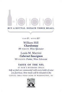
And that's the wine list for Nick's Riverside Grille. Drink up!


And that's the wine list for Nick's Riverside Grille. Drink up!
Labels:
design
Subscribe to:
Comments (Atom)


